At Tint, our capital partners didn’t have an easy way to track how their products were performing. Data was scattered, and both internal teams and external partners were struggling to get visibility into key metrics like risk and profitability.
I joined the project as the lead designer to help solve that. Working closely with product, engineering, and capital partners, I helped shape a dashboard that gave everyone a single source of truth. This is the story of how we designed it — and how we made it work for very different types of users.
My Role
- Translated capital and underwriting pain points into product requirements
- Designed a dashboard system to surface risk signals, track profitability, and support compliance
- Worked with engineering to explore build vs buy options (like Metabase)
- Partnered closely with PM and actuaries to handle complexity like IBNR inputs and exposure layers
How I Designed It
When I joined the project, the challenge was clear: we needed a unified dashboard that could present complex data in a way that was intuitive for a wide range of users, including internal stakeholders and external capital partners. The data they were working with ranged from performance metrics to risk analysis, and the current system was fragmented, making it difficult for users to gain meaningful insights.
- User discovery: Sat in on calls with capital partners, underwriters, and internal teams to learn where the gaps were
- Scope alignment: Mapped contract obligations and internal KPIs into the dashboard’s structure
- Design system: Created a layout that adapts to different levels of granularity (program, product, geo, time)
- Prototyping: Built a Figma prototype with threshold logic, flags, and freeze controls
- Iterated with data: Pulled fake data into Figma to stress-test the visuals and uncover edge cases
Key Design Decisions
- Grouped KPIs by exposure level so risk is easier to assess
- Introduced threshold-based alerts to flag when action is needed
- Added “freeze data” logic to lock reports to financial periods
- Built for dual audiences: internal and external users with very different mental models
Design Outcome
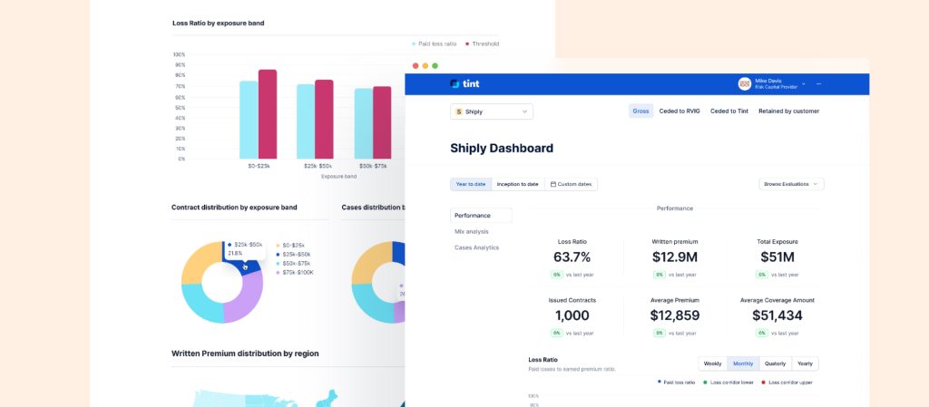
1. Dashboard Overview
The first thing users see is a dashboard that gives them a quick look at how their program is doing. It shows key numbers like the overall loss ratio, total in-force premium, and how the program is spread across different regions. This snapshot helps users understand the program’s health and spot any areas that need attention.
2. Program Performance Details
If users want to dig deeper into a specific program, they can. The performance details page gives them a full view of how the program’s been doing over time. It includes charts and graphs that show things like loss ratio by exposure band, rolling loss ratio, and policy breakdown by region. Users can adjust the time frame to spot trends and see how things have changed.
3. Threshold Monitoring
To make sure users stay on track, the feature has threshold monitoring. If a program goes over certain limits, users get visual alerts and notifications. These alerts let them know when action is needed—like adjusting rates, managing risk, or changing the program. It makes sure users never miss an important update and can take action right away.